My role:
Client:
Process Lead • Service DesignerClient:
Orange Polska Telecommunication Duration: 3 weeks • Year: 2019As a Team Lead and Workshop Facilitator, I performed study for a voice‑driven service, shaping how users interact with the product through tone, language, and behavior. Worked directly with product, with great UX Research team, Product Owners and main designers of My Orange app to develop a guides for future product communication.
This research was a step in a more significant process, with the My Orange app emerging as a key example for an omnichannel approach.
Why was the app better at communication than other products?
Designed primarily for digital users, the app was always helpful in managing services and payments, driving user engagement. Its success inspired the company to leverage this experience to enhance other channels and products. But how?
Preparing this research, we focused on understanding the role of mobile app in the whole customer experience. We wanted to uncover why users favour the My Orange app over other digital channels.
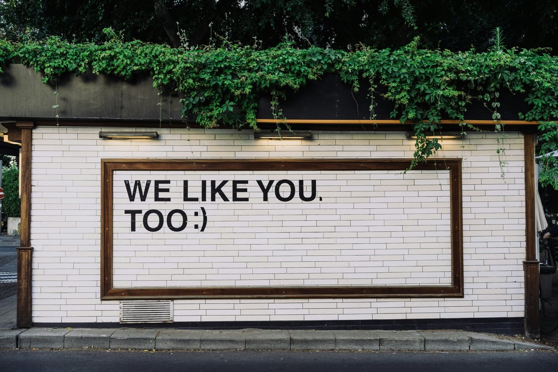
👉🏻 The app’s friendly voice stood out, but our research showed that communication is never certain—there’s always more to discover.
Main goals
Multichannel customer service aimed to reduce non-digital support traffic by creating a new way to communicate with users that is both universal and engaging.
Multichannel customer service aimed to reduce non-digital support traffic by creating a new way to communicate with users that is both universal and engaging.
Results
Clear distinction between app communication and brand communication, with flexible and contextual rules for diverse products and channels.
About users and app itself
Digital channels aren’t easy to introduce when the average client is 35 or older. Although the company used voice and chat AI bots for service, digital channels weren’t the primary choice for resolving issues or offering changes. Customers preferred reassurance from real people and were reluctant to give up traditional support channels like calls and consultants. With My Orange as an exception.
We assumed that cool communication was key to the popularity of the app. Understanding what made the app experience stand out could help incorporate its unique value within the broader customer journey. But first, we needed to understand it better.
– it became motto of this process
The process of research and the funny parts of it
Step 1: Building identity archetype
Goal: Finding an identity best suited to describe the way that your product communicates
Methodology: Design Workshop, Archetype and Brand Voice Matrix
To identify the Tone of Voice, there seems to be no better solution than turning our app into a persona and letting it speak and act uniquely, like your best handyman, or maybe a friend. We wanted to bring this archetype to life, perhaps by creating an avatar like Mailchimp or InPost.
from designer iteo Dribble Account
Inspirational examples:
- Fenomenal InPost brand identity & more
(I use this app with joy!)
- Mailchimp with a high-five persona
- Ralph Robot - Facebook bot from Lego
- Virgin Mobile Game of Phones
Detailed Workshop Scenario
Opening
Based on the previous research, we took a quick peek into gathered data about our users.
Work with communication examples
We chose four main communication themes (neutral, positive, problem, and offer) to analyze them. Then, we asked how they sounded and what their main goal was to create a simple matrix for further work.
App impersonation
Participants engaged with the app’s voice feature to answer authentic questions. This interaction yielded valuable insights into understanding and addressing user needs.
Work with Archetypes
Working with the 12 Archetypes Matrix, we chose three leading roles for our application and expanded those roles into simple personas.
Basic Question we asked to build an archetype:
- What is the primary goal of this identity?
- What kind of emotions does it create?
- What action does it take?
- How does it express itself?
- What does it try to avoid?
- What is a red flag for this identity?
The effect of the archetype discovery workshop is like 👇🏻. With strong statements, main goals, and big NOs.
Step 2: Define Roles
Goal: Identify key “jobs to be done” and align the app’s roles with user needs and expectations.
Methodology: Design Workshop
During the workshop, we realised the app’s voice should flex to fit the moment: guiding when users are lost, serious when solving problems, informative when new features are introduced, and playful for casual vibes. This sparked the idea of creating personas based on archetypes to match these roles.
To nail down the perfect communication strategy, we devised three potential app personas designed to truly click with our audience.
Step 3: UX Writing Prototype
Goal: Creating an extended matrix of diverse messages for in-depth testing
Methodology: Designed survey (quantitative data and respondents' statements)
We wanted to test how users felt about information delivery. So, we let them pick how they wanted to receive important info based on three personas and six different scenarios. We also needed to know the users' reasoning for the above quantity data, so we asked them why they chose specific answers.
How did we do it?
- We chose four basic messages/statements, from error to successful payment info, and UX Writer gave three communication styles to each statement: formal (Teacher), informal (Advisor) and funny (Buddy)
- UX Research Team created a survey matrix in the users’ panel, where we asked our clients which style in every statement suits them best and worst, and why
- We gather quantitative data and respondents' statements
Step 4: Message duel (and unexpected insights)
Goal: Test our hypothesis, understand the main direction
Methodology: Designed survey (quantitative data and respondents' statements)
What did we discover?
The main conclusion from our duel was that our personas worked well, but the key takeaway was understanding user emotions during conversations with the app. We observed three states in users’ statements:
- rational (essential for every type of communication),
- emotional (offering, marketing),
- and problem-focused (action, problem, payment, etc.).
Users voice
When making bank payments, I prefer a factual message that inspires trust.
The imperative mood [in offering communication] is offensive!!! *
I think that every message should be professional, without any joking texts!
[offers and payments]
Cold, ice. Better to write it in friendly language.
[about formal language]
* Polish audiences often find direct sales language like ‘Buy now!’ or ‘Don’t miss it!’ pushy and money-grabby. Such aggressive messages can feel insincere and disrespectful in our culture, making subtle, value-driven communication far more effective.
How we got it wrong and why it was good thing
The message duel was quite an interesting experiment with live users’ feedback. It’s clear that, as designers, we sometimes strive for bold innovation, but user experience often benefits from steady predictability. We tried to make communication more flashy and catching, but that was not the way. I think that it's a vital and pretty obvious lesson from this case:
Our humble experience has taught us to truly listen to users’ real voices and understand their feedback.
Our Insights
Our prediction was wrong
Every time users pointed out a style matching a statement, we were surprised by their choice. Once more, we realised we were not our clients.
No one chooses funny. Ever. Not even once
And even slightly softening the tone around payment and price information only raised suspicion and distrust, making users wonder if there was a hidden catch. This method of communication failed to resonate with users. Our app was not meant to be funny; it was just that.
Context is everything
We can't talk funny about money, we can't be too strict about offers, and we can’t be too formal about app problems. It goes and goes… Every word was important. And every context had its own set of rules
We even found this evil example of how not to talk with a client:
Brainstorming and conclusion
Detailed Workshop Scenario
Multichannel mapping process
Focusing on multichannel experience, first, we determine who speaks through the My Orange app and why. Putting user experience at the centre of the equation, we build a layered map of influence and communication from the backend through marketing, customer service, general brand communication, stakeholders, etc.
Tone of voice matrix
Using this simple exercise, we created a general Matrix for future use in communication planning.
First, we determined what type of information message is being used by creating a sentence: When [context] the app [what is doing] for a user to [what user needs from this action]. Then, we used the Matrix with sliders to precisely determine the specific tone and apply it to one of two communication sides.
We called them: “Very Orang - for strict brand communication and “Wink-Winkink App” for more funky situations.
Communications stream
During the workshop, we worked on a precise line between visible communication for a client (customer service, website content, app content, etc.) and parts behind a curtain (system communication, offer planning, etc.). We gathered stakeholders' information, different product teams, and company siloses to generate the first draft for the communication stream in a multichannel experience.
Using a simple matrix, we created more of a methodology for further work than an actual communication guidebook. It was quite obvious that every channel and every part of communication has its unique impact on users and needs to be carefully planned to serve them well. It helped us understand the nuanced role each touchpoint plays in building engagement and the importance of consistency across all communication channels.
Final recommendation:
- More user research focused on different statements and their variations.
- A clear vision of the differences between app communication and brand communication. Different channels = different voices.
- Communication guide and strong identity statement, but flexible approach with lenient rules for situations beyond standard contracts and pricing.
- Keep it simple. Language should serve communication, not beautify the design. Shorter is better.
Lessons for the year 2025
From my experiences with different products, I learned that the tone of voice in service-enabled applications is often layered. I split it into two categories:
- Passive (e.g. error messages, system updates, confirmation, warnings)
- Active (e.g. offering, required action communication, reminders, processes)
Those two communication layers affect user experience differently and need separate content rules. The first should be simple, clear, and direct. The second can be softer, more creative, and varied.
I would use this idea in workshops and research to build bolder prototypes and suggest having two different teams for content creation. Also, from experience with smaller companies, the tone of voice (ToV) is often expected to represent the brand and fit a specific customer group. That’s fine. But in large companies like Orange, with many products for diverse user groups, there are many voices. The main goal is to keep these voices unified while preserving their unique personalities.
• Joanna ‘Wave’ Sabak • j.b.sabak@gmail.com • tel. (351) 924-706-735 •
 Made with Bullet